
I have always wondered how movie-makers decide on what colors to use for any given part of the movie. I had a rough idea that certain colors tend to make certain scenes look cheerful or dreary, or even nostalgic or dreamlike. I also more-less had a sense that some colors must simply good together, but I was also more-less clueless as to which combinations did. This curiosity applies as well when I look at paintings, animations, well-designed cafe interiors and almost anything that combined colors well. Color was confusing.
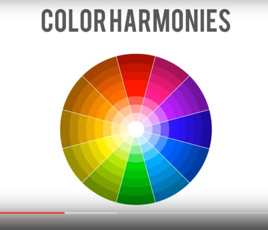
Blender Guru’s YouTube video ‘Understanding Color’ was most salutary. It starts off explaining why color is important; color guides the viewer, tells the story, changes the mood and draws attention to things. He uses examples of artworks to show, in terms of saturation and value of colors, how they can be used effectively, or incorrectly. More importantly, it introduced to me the different types of color harmonies : Monochromatic, analogous, triadic, complementary, split complementary and tetratic. Using a color wheel and a range of examples of paintings, animations and photographs, he showed how different combinations of colors work together, their effects, and how to combine them well.
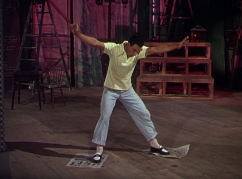
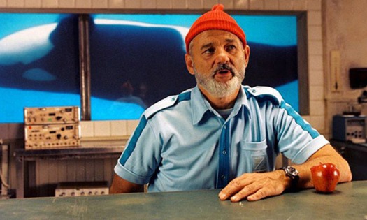
I’ve learned a lot through this video. And although color still is, more-less confusing, I am definitely able to appreciate works of art a lot more now. Here are some color harmonies I spotted in some films.

I find this post very interesting! Not only does it make me curious about the matter, it is also informative. I will definitely check out more videos like the one you’ve mentioned.
LikeLike