We will endeavour to use people and information only with their consent. We will also ensure no one comes to harm during the production of this documentary and nobody feels uncomfortable during filming. We will also ensure there are no trip hazards and our project will not damage anything. Minors and vulnerable people will only filmed if there is permission from all concerned parties and there will be notice for be people who don’t want to be filmed.
Shot list
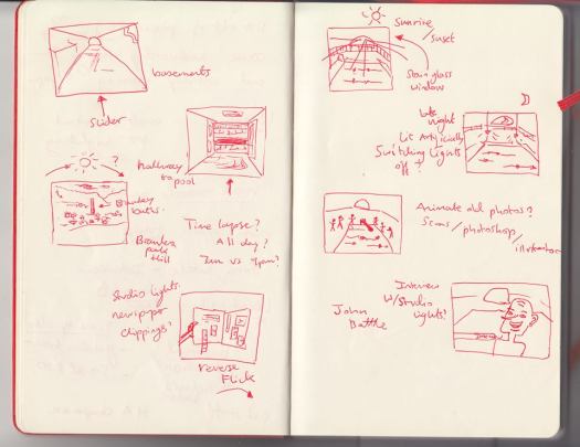
S&R Critique notes
Here are the notes written down by Zeyna after our critique with Annabeth.
Talk to jack from over 60s maybe interview him cuz he should know a lot about BB
Ask Courtney why we’re filming this and the purpose behind it.
More light shots, focus on shadows
Use a tripod!!!
Long stills of something. (A lot of them, useful when editing)
Make sure they put the question in their answers
Open questions : tell me about history of building
Test interviews
Here are the test interviews we did after our Interview Skills workshop in which we were introduced to several types of microphones such as the La Pelle microphone and the Shotgun Microphone, and different ways of recording audio.
<p><a href=”https://vimeo.com/155689115″>Test interviews</a> from <a href=”https://vimeo.com/user43069978″>Yves Robinson</a> on <a href=”https://vimeo.com”>Vimeo</a>.</p>
Understanding Color.
I have always wondered how movie-makers decide on what colors to use for any given part of the movie. I had a rough idea that certain colors tend to make certain scenes look cheerful or dreary, or even nostalgic or dreamlike. I also more-less had a sense that some colors must simply good together, but I was also more-less clueless as to which combinations did. This curiosity applies as well when I look at paintings, animations, well-designed cafe interiors and almost anything that combined colors well. Color was confusing.
Blender Guru’s YouTube video ‘Understanding Color’ was most salutary. It starts off explaining why color is important; color guides the viewer, tells the story, changes the mood and draws attention to things. He uses examples of artworks to show, in terms of saturation and value of colors, how they can be used effectively, or incorrectly. More importantly, it introduced to me the different types of color harmonies : Monochromatic, analogous, triadic, complementary, split complementary and tetratic. Using a color wheel and a range of examples of paintings, animations and photographs, he showed how different combinations of colors work together, their effects, and how to combine them well.
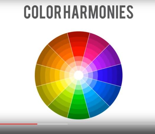
I’ve learned a lot through this video. And although color still is, more-less confusing, I am definitely able to appreciate works of art a lot more now. Here are some color harmonies I spotted in some films.